AEM Style System Reuse Components Without Duplicating Them
Learn how the AEM Style System connects Client Library CSS, component policies, and author-selected styles. Use it to provide controlled visual variations in the AEM Page Editor without duplicating component implementations.
The Problem: One Component, Several Approved Appearances
The previous chapter explained where authors compose content. A Layout Container controls the page area and grid; it does not decide whether a Teaser should look like a standard card, a dark campaign panel, or a featured promotion.
Those variations are common. A product page may need a quiet Teaser with a white background. A campaign page may need the same Teaser with a dark background, larger title, and different spacing. Creating a separate component for each visual variation produces duplicate dialogs, HTL, tests, and maintenance work.
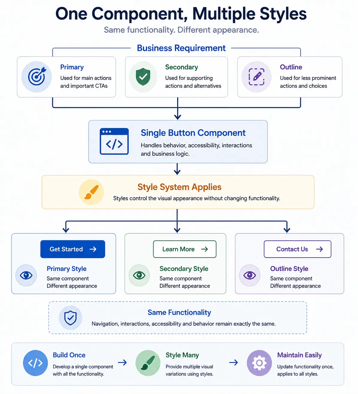
The AEM Style System handles this case. It lets a project offer named, approved visual variations for one component implementation.
This chapter covers the Style System in the AEM Page Editor. Universal Editor uses a different styling model.
What AEM Actually Does
The Style System is not a CSS editor for content authors. It is a controlled mapping between a friendly name in AEM and a CSS class supplied by the project.
When an author selects a style, AEM stores the style selection with the component, and the configured style class is applied through the component's decoration wrapper. The component implementation continues to render its normal content; the Client Library CSS uses that class to change the presentation.
For a style to work, three things must be present:
- The component must support the Style System. Core Components support it; a custom component needs the required Style tab configuration.
- The project must deploy the CSS class, and any necessary JavaScript, in a Client Library that the page loads.
- A template author or developer must expose that CSS class in the component's content policy with a name authors understand.
If the class exists in the policy but the Client Library is not deployed or not included on the page, the author can select the style but the published component will not change. That is a configuration problem, not an authoring problem.
Component Styles and Page-Level Styling
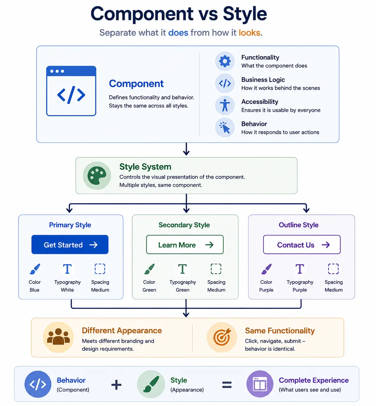
Most Style System decisions concern a component. A component policy can offer styles such as Standard Card, Featured Card, or Dark Card for a Teaser. The author chooses one when editing that Teaser.
Page-level styling is typically established through the page's template and policy configuration, including the Client Libraries loaded for that page. It commonly controls page-wide Client Libraries, such as a brand or campaign theme, and establishes the styling baseline used by all components on that template.
Keep the two levels separate. A page-level theme should not require an author to apply the same component style to every Teaser. A component style should not be used to create an entirely different page theme. When both are needed, the page policy provides the baseline and the component policy supplies local, approved variation.
Style, Configuration, or a New Component?
The question is not simply whether something looks different. Check what the requirement changes.
Use a style when the component's content model, semantic markup, authoring task, and runtime behavior stay the same. A Teaser changing from a light card to a dark card is a style decision.
Use component configuration when the existing component already supports the requested behavior and the author is selecting a valid option in its dialog. For example, a Teaser may already support an image position or call-to-action setting as part of its intended model.
Create a new component when the requirement introduces a different content model, semantic structure, authoring workflow, or runtime behavior. A promotional Teaser and a product-price component may both show an image and button, but they represent different data and responsibilities.
This prevents two opposite problems: duplicate components for a color change, and one overloaded component with unrelated dialog switches and styles.
Giving Authors Useful Choices
Authors should see names that describe a purpose, not implementation details. Featured Card is useful; teaser--variant-3 is not.
Policies can group styles and decide whether choices in a group are mutually exclusive or can be combined. Treat that as a product decision, not a convenience setting. Every allowed combination must be designed, tested, and understood by authors.
Avoid exposing every possible CSS class. A long list of switches creates an untestable combination matrix and makes it harder for an author to know which choice is correct. Prefer a small number of complete, named variants over several low-level color, spacing, alignment, and border options.
Who Owns Each Part
- Designers define the approved visual variants and their purpose.
- Front-end developers implement those variants in scoped CSS and, where justified, client-side JavaScript.
- AEM developers deploy the Client Libraries and ensure custom components support the Style System.
- Template authors map friendly style names to the deployed CSS classes in component policies.
- Content authors select from the approved names while authoring a page.
The boundary matters. A content author chooses an established variant; they do not create a CSS class or invent a combination that has not been reviewed.
Example: one Teaser, three approved appearances
An e-commerce site uses one Teaser component across product, campaign, and editorial pages. The component always stores the same fields: image, title, description, and call to action.
The design system defines three tested variants: Standard Card, Campaign Feature, and Dark Promotion. The front-end team implements the corresponding CSS in the site Client Library. A template author adds those styles to the Teaser policy and makes the three variants mutually exclusive.
An author building a campaign page selects Campaign Feature for one Teaser and Dark Promotion for another. The content fields and component behavior stay the same. If the requirement later adds a product price, inventory state, and commerce API data, that is no longer a Teaser style; it needs a component designed for product data.
Common Mistakes
- Adding a policy entry without CSS. AEM can display the style name even when no deployed rule implements it.
- Using a style to hide a behavior change. A visual variant must not quietly change what a component means or how it behaves for users.
- Allowing conflicting combinations. If two styles cannot coexist, make them exclusive in the policy.
- Using generic class names. Scope styles to the component so a Teaser variation cannot unexpectedly affect another component.
- Creating a new component for every brand color. Keep visual variation in the Style System when the component responsibility remains the same.
The decision to carry forward
Use the Style System when only presentation changes. Keep content fields, semantic markup, and runtime behavior the same. A style that quietly changes what a component means is a new component or a clear configuration decision, not a visual variant.
Next: Core Components provide the reusable component implementations that templates, policies, and styles build on.
Enjoyed this chapter?
Get an email when I publish the next chapter. No spam — just new technical deep-dives.
Comments
Share feedback or questions about this blog post.
No comments yet. Be the first to share your thoughts.