Layout Containers and Responsive Grids
Understand how AEM Layout Containers and Responsive Grids control page composition. Learn the responsibilities of template authors, developers, and content authors when building responsive pages in the AEM Page Editor.
From Page Structure to Page Composition
The previous chapter established the authoring boundary: template structure keeps required elements such as the header and footer in place, while policies limit what authors can add.
That still leaves an important question. Where does the content for a particular page go, and how can an author arrange it without creating a new template for every variation?
The answer is the Layout Container. It provides the editable paragraph system inside the template. The Responsive Grid gives that container a column system that can change by breakpoint.
This chapter covers Layout Containers used with the AEM Page Editor. It assumes that the site has an editable template and a responsive front-end grid already in place.
The Problem a Layout Container Solves
Consider a campaign-page template with a fixed header, footer, and main content area. The campaign team may need a full-width hero on one page, a two-column product section on another, and a row of three promotional cards on a third.
Creating a template for every one of those arrangements would make the template library difficult to govern. Leaving authors with one unrestricted content area creates a different problem: they can assemble layouts that do not match the design system.
A Layout Container sits between those extremes. The template provides the container and its rules. Authors place approved components in that container and arrange them within the grid.
Layout Container: the Authoring Boundary
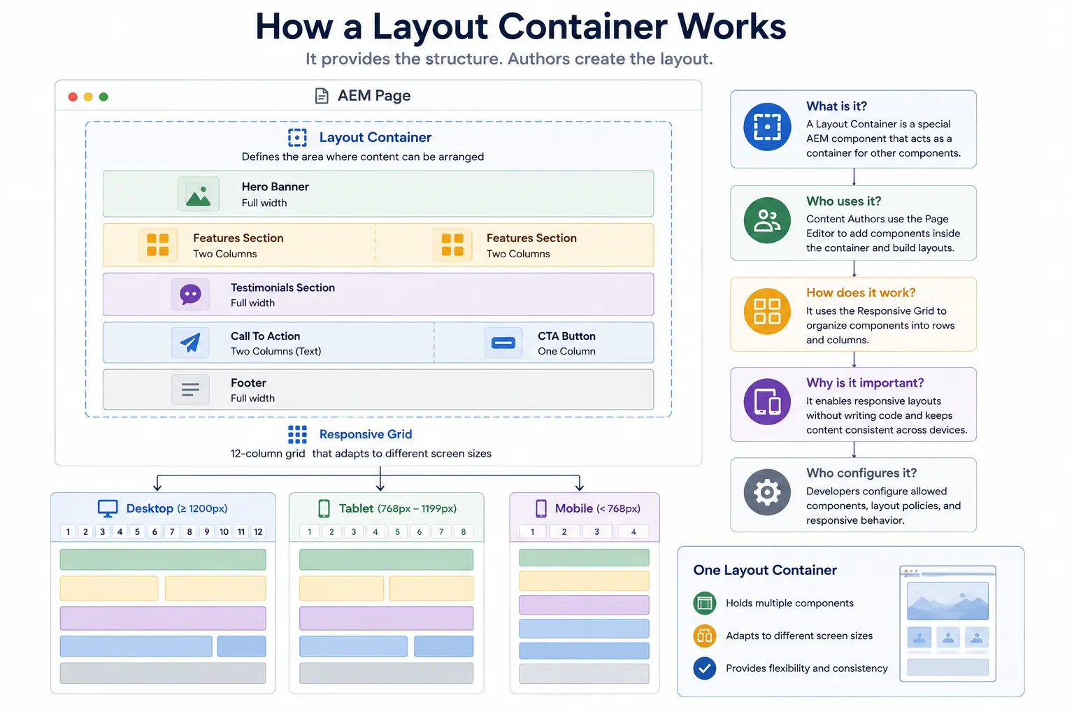
A Layout Container is an AEM paragraph system that allows authors to place components and control their layout within the available grid. It can be the main content area of a page or a nested container inside a section.
The container does not supply the business content. A Text component, Image component, or custom Product Card supplies that content. The container decides where those components can be placed and how they are arranged.
That distinction matters when debugging. If a component is missing data, investigate the component and its model. If the component is in the wrong column or overlaps another component at a breakpoint, investigate the Layout Container, grid configuration, and CSS.
Responsive Grid: the Layout Mechanism
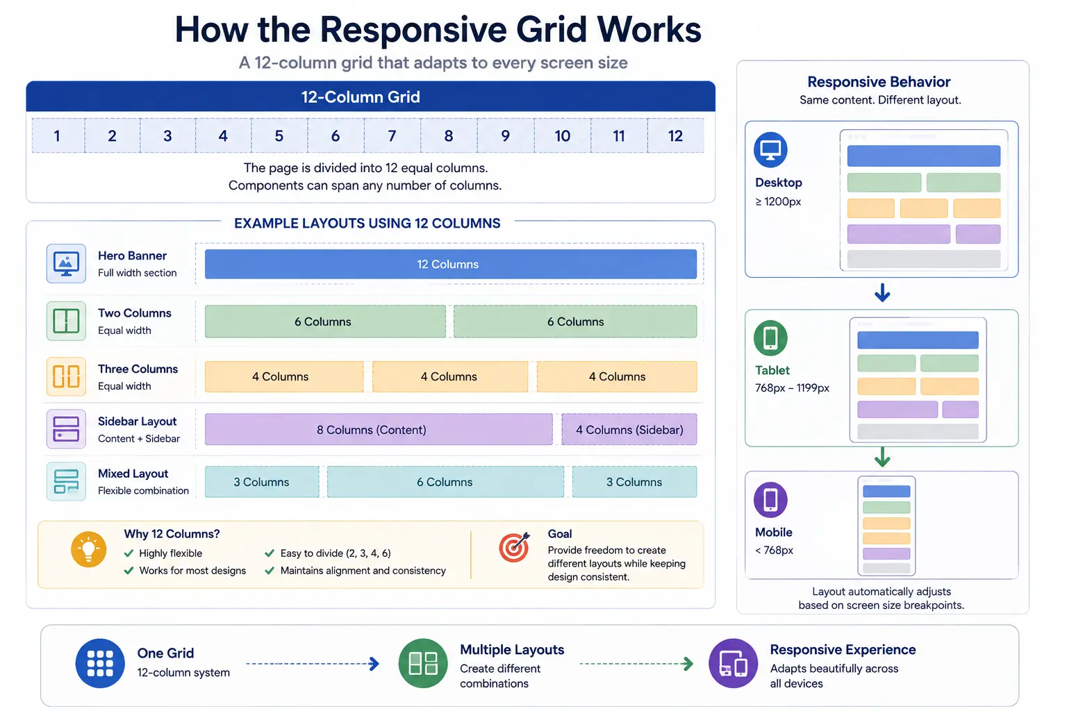
The Responsive Grid provides the column-based layout system used by a Layout Container. It lets an author place components side by side, resize them to grid columns, and decide how they reflow at a configured breakpoint.
A 12-column grid is common because it supports useful combinations: a full-width component can span 12 columns, two equal components can span 6 columns each, and three equal components can span 4 columns each. Twelve is a project choice, not an AEM requirement. The number of columns is configured for the Layout Container.
Breakpoints are also project configuration. A template or page defines the breakpoint names and widths, and the front-end grid CSS must use matching media queries. Labels such as phone, tablet, and desktop are convenient names; they are not a guarantee that one layout works for every device in that category.
What Developers and Template Authors Configure
Responsive authoring works only when the project configures the pieces together.
- Developers provide the responsive grid CSS and make its breakpoints match the breakpoint definitions used by AEM.
- Template authors add Layout Containers to the template, set the available grid columns, and apply policies.
- Policies decide which components can be added to a particular container. A product-page content area may allow Product Card, Image, Text, and Button components, while a narrow sidebar might allow only navigation and promotional components.
- Component developers ensure that their components behave well at the supported widths. A grid can resize a component, but it cannot make an unusable component responsive.
This is the boundary that protects the design system. Authors control composition inside approved containers; they do not define breakpoints, introduce arbitrary components, or repair responsive behavior with page-specific CSS.
What a Content Author Does
Content authors work in two different Page Editor modes.
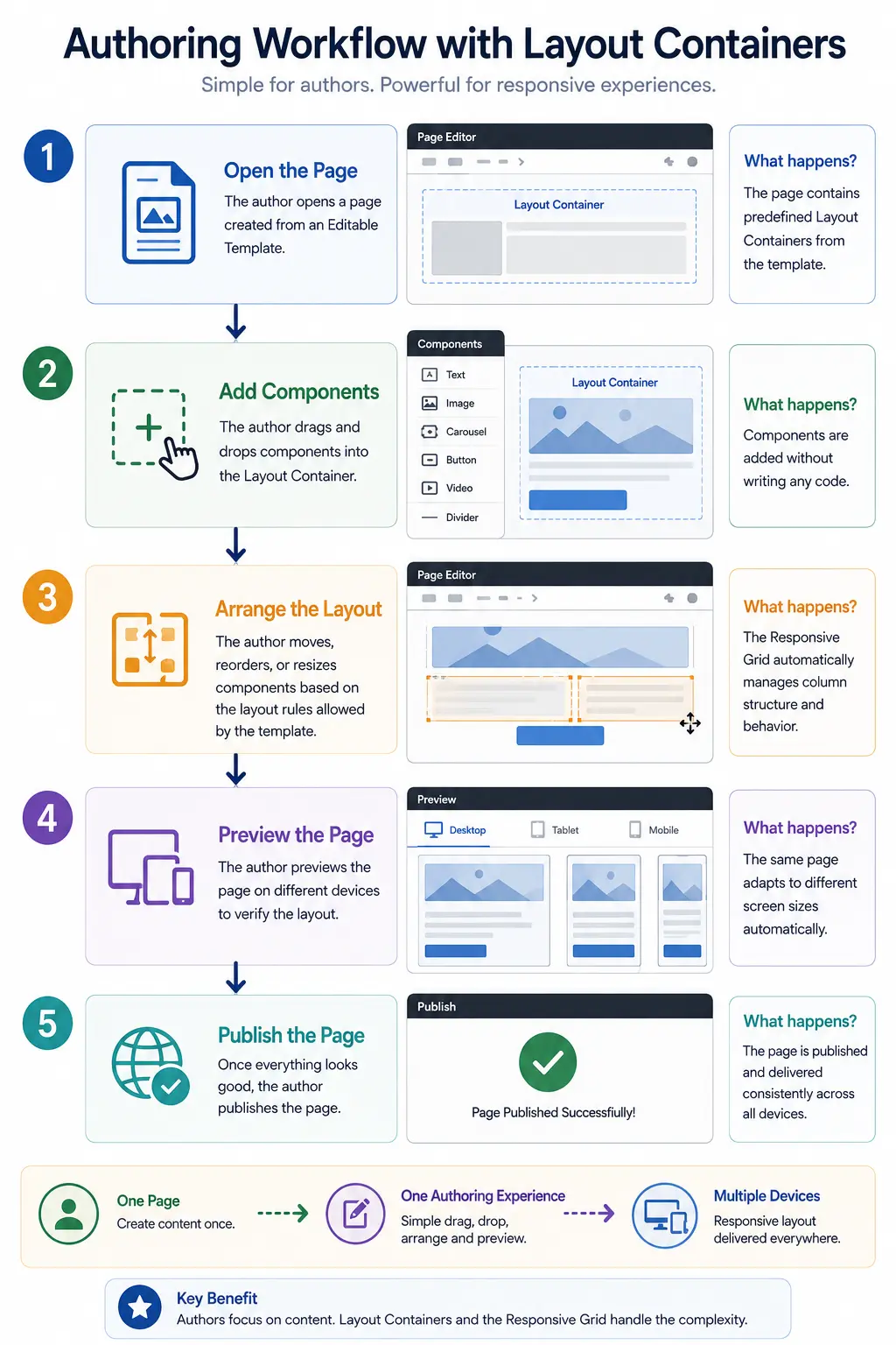
In Edit mode, they add approved components to an available Layout Container and author the component content. Whether a container accepts a component is controlled by its policy.
In Layout mode, they select a breakpoint through the emulator, place components on the grid, resize them, and set their layout for that breakpoint. AEM snaps the component positions to the grid and can reflow components from side by side to stacked.
The author should preview each supported breakpoint before publishing. The emulator is an authoring aid, not a substitute for checking the published page in the browsers and devices the project supports.
A Common Failure Mode
Teams sometimes assume that a Responsive Grid will fix every responsive problem. It will not.
For example, a card component may look correct in a wide column but become unusable when its title, image, price, and button are squeezed into a narrow column. The grid changes the component's available width. The component's CSS and markup still need to handle that width correctly.
The right response is not to give authors more freedom to add custom CSS. Check the component at each supported width, fix its responsive behavior in the component implementation, and keep the template policy focused on the layouts that the design system actually supports.
Example: a campaign page with controlled variation
An e-commerce team uses one Campaign Page template for a seasonal promotion. The template supplies the fixed site frame and a main Layout Container. Its policy allows Hero, Product Card, Text, Image, and Button components.
An author creates a campaign page, adds a full-width Hero, then places two Product Cards in a row. In Layout mode, the cards occupy half the grid on the wide breakpoint and stack on the narrow breakpoint. The author can create this variation without a developer changing the template, but cannot introduce an unapproved component or alter the project's breakpoint system.
That is the intended division of responsibility: reusable layout rules live in the template and front-end implementation; campaign-specific composition and content live on the page.
The decision to carry forward
Layout Containers govern composition; they do not make a component responsive by themselves. The front-end implementation must support the configured widths, and policies should expose only the layouts the design system can support.
Next: the Style System covers controlled visual variation once a component has been placed.
Enjoyed this chapter?
Get an email when I publish the next chapter. No spam — just new technical deep-dives.
Comments
Share feedback or questions about this blog post.
No comments yet. Be the first to share your thoughts.